
Conceived. Proposed. Re-branded.
![]()
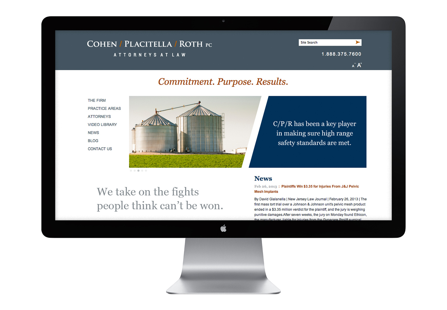
The law firm of Cohen, Placitella & Roth, PC (CPR) approached us to strengthen their visual image. We began with an assessment of their print and digital collateral and concluded that the veteran law firm was replete with stunning results and compelling messages. We also saw opportunities for greater visual clarity and a clean, consistent design approach across the board. In addition, the firm’s name appeared in several different fonts and colors, but this variety lacked purpose. We decided to take a stand there.
Since 1973, CPR has maintained a persistent voice—advocating for their clients and being dedicated to their clients’ causes. Their logo needed to mirror that determination with a time-tested, meticulously crafted font that messages both endurance and strength. To highlight their distinctive style and the creative lens through which they approach each case, we omitted the conventional commas and ampersand in favor of a contemporary forward slash. This direct and punctuated approach is presented as an indelible word mark through engraving or embossing techniques on printed materials. The final logo has an extended full-name version as well as a shortened version. The latter is used in all new communications to introduce their main message. “CPR: It’s what we stand for—Commitment. Purpose. Results.”
After establishing the two-color palette for the word mark, we expanded the system to include a handsome spectrum of grays and navy blue. These accompany the bold rust color that is employed as an accent throughout. It all comes together in a variety of print communications and on their newly redesigned website (cprlaw.com).
See more views of this work under Identity.